The Pantone colour of the year, Very Peri, is a cheerful change from last years nomination (dead boring Ultimate Grey). The latest colour trend offers designers a chance to play with new shades and unexpected colour combinations.
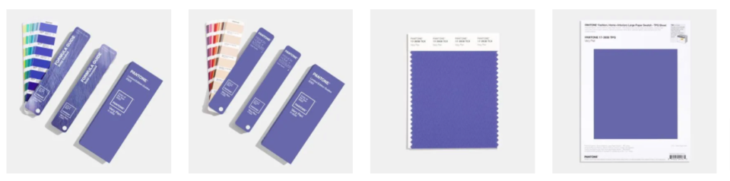
In keeping with its traditional colour forecasting, Pantone chose the colour for what it says will be the overarching trend in design for 2022. The company has been releasing its annual colour of the year since it began its forecast in 2000. Past years’ colours have included Rose Quartz, Serenity and Tangerine Tango.
“As we move into a world of unprecedented change, the selection of PANTONE 17-3938 Very Peri brings a novel perspective and vision of the trusted and beloved blue colour family,” says Leatrice Eiseman, Executive Director, Pantone Color Institute.
Pantone says that its colour of the year “reflects what we see happening in culture, on the runways, in homes and offices and at retail” and “captures the tenor of what’s to come by shedding light on emergent trends.” The company said that this year marks the first time it has created an entirely new colour instead of choosing one from its roster.
Describing Very Peri as a periwinkle blue hue with a violet red undertone, Pantone said Very Peri is the “happiest and warmest of all the blue hues,” which symbolises transition and new possibilities.