The trends we’re seeing (and actually like) in 2025
If you’ve been keeping an eye on websites lately, you’ve probably noticed things are getting a bit… different. More colourful, more curved, and definitely more experimental.
As someone who’s been designing websites for businesses for over 15 years, I can tell you that 2025 is shaping up to be one of the most interesting years for web design in ages.
So, what’s happening out there? Let me walk you through web design trends 2025.
The 97% Layout – Taking Up All the Space
Here’s something I’ve started calling the “97% trend.” Basically, websites are using almost the entire width of your screen instead of that narrow-column approach we’ve been stuck with for years.
Think about it – why waste all that screen space?
I’ve been noticing this everywhere:
- Victorian Opera’s website – Their content flows right to the edges, creating this immersive, theatrical feeling
- Stay In Touch Studio – They let their text breathe across the full width, making everything feel more personal
- We Are Found – Their property content gets room to make an impact
- Sketch Studios – The wide layout gives their workplace designs space to shine
It’s bold, it’s confident, and it makes sense. Your mobile phone uses the full width, so why shouldn’t your desktop site?
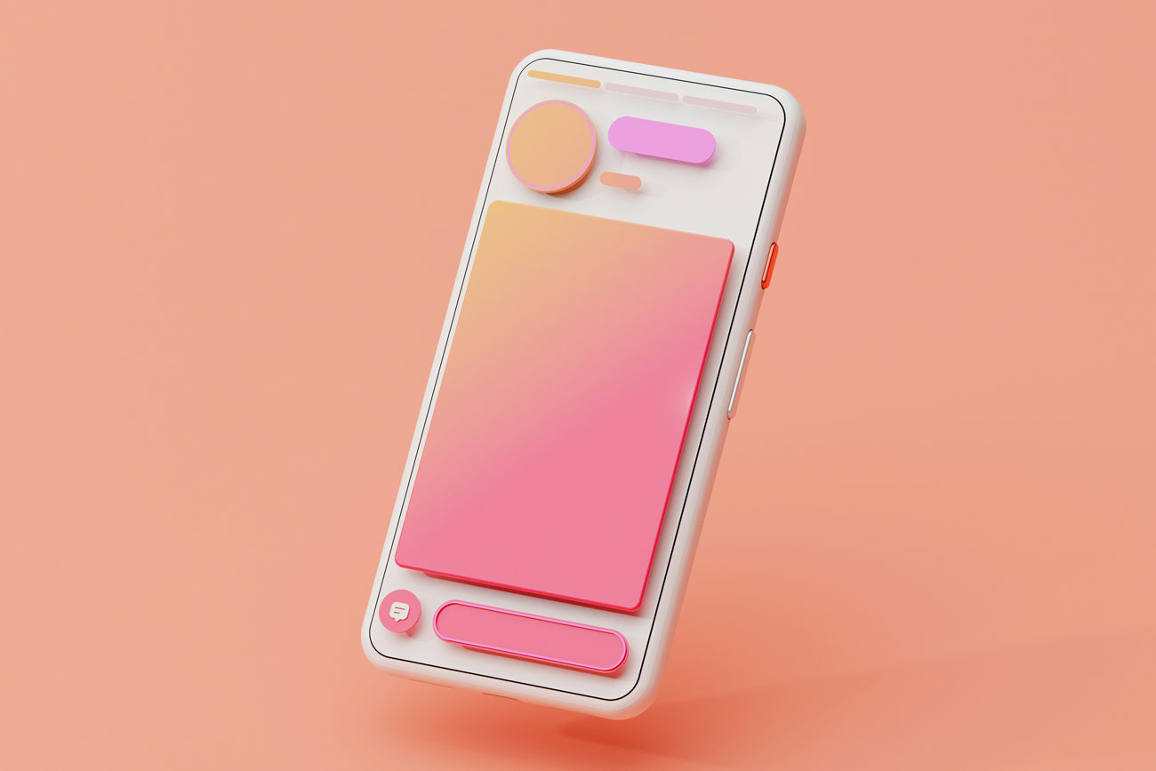
Colours That Glow
Remember when every website was grey and white? Those days are well and truly over. I’m seeing colours so bright they practically jump off the screen. Electric blues, neon pinks, lime greens – the works. It’s what the design world calls “Vivid Glow,” and it’s everywhere.
Native Inc is a perfect example. Their crypto insurance site uses these electric blues and vibrant gradients that grab your attention immediately. It shouldn’t work for an insurance company, but somehow it does.
And here’s the thing – gradients have been going strong since 2024, but now they’re animated. Instead of static colour blends, you’re getting these flowing, moving gradients that feel alive.
Curves Are Taking Over Everything
You know what else I’m seeing everywhere? Curves. Organic shapes. Flowing lines that make websites feel less like computer programmes and more like, well, something a human might want to look at.
JCM.ch does this beautifully. Their Swiss design studio site flows and curves in engaging and inviting ways.
Continuing from 2024, the bento box layout is huge right now, too. It’s taking inspiration from Japanese lunch boxes – those little compartments that organise everything perfectly. Each grid box has a curved radius.
Some sites doing this well:
- Literal.club – Clean, organised bento grids that make sense
- Atmosphere FM – A music streaming concept that uses rounded sections perfectly
Why the shift to curves? Because everything else feels increasingly robotic. Hand-drawn elements and natural textures help websites feel warm and relatable.
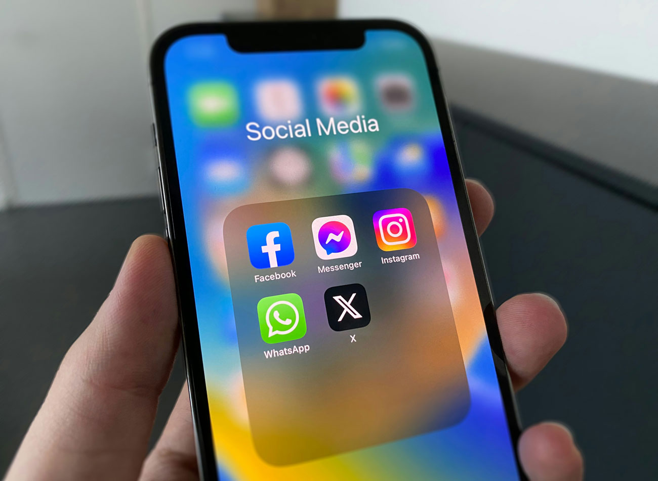
AI That Remembers You
Remember when chatbots were just those annoying pop-ups asking, “Can I help you?”
AI has come a long way since then. Today’s chatbots understand what you’re asking and can hold proper conversations.
They’re not just answering FAQs anymore – they’re booking your holidays, suggesting products, and even remembering what you talked about last time.
Notion AI does this really well. Instead of starting from scratch every time, it remembers your projects and preferences.
Microsoft Copilot shows you exactly what it’s doing with clear progress messages. Meta AI works with rich visuals across Instagram and WhatsApp.
The smart ones now:
- Remember conversations from weeks ago
- Learn your preferences over time
- Understand when you’re frustrated and adjust accordingly
- Pull live information instead of giving you outdated answers
It’s a far cry from the “How can I help you today?” reset we’re used to.
Breaking All the Rules (On Purpose)
Here’s where things get interesting. There’s a whole movement of designers who are deliberately breaking every rule we’ve been taught about good design.
Think clashing colours, wonky layouts, and fonts that make your eyes water. It sounds awful, but when it’s done right, it’s surprisingly effective.
This “anti-design” approach includes:
- Asymmetrical layouts that feel deliberately unbalanced
- Experimental typography that looks hand-scribbled
- Colours that clash on purpose
- Layouts that feel chaotic but somehow work
This trend is not for everyone, but perfect for brands with an edge.
Gaming Meets Web Design
Websites are getting more interactive, and gaming culture has a lot to do with it. Think: hover effects that react like buttons in a video game, ambient lighting, and those glassy, layered panels you’d expect in a sci-fi interface.
We’re seeing:
- Translucent layers that mimic HUD (Heads-Up Display) visuals
- 3D movement and scroll-triggered animations
- Cursors that feel more like controllers than pointers
- Subtle audio or motion cues that reward interaction
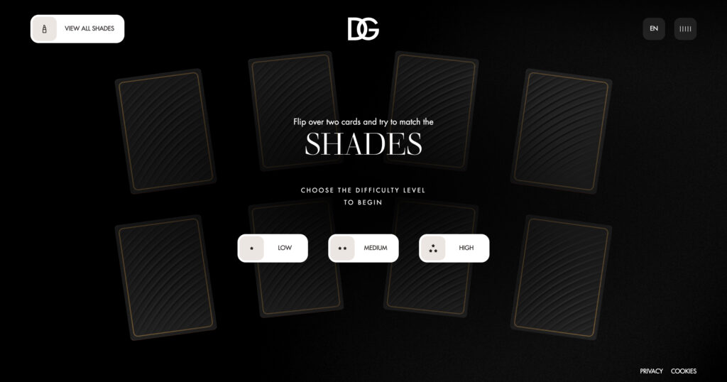
D&G’s Lip Stylo site takes it further. Instead of browsing lipsticks, you play a memory game. Match the shades, race the clock, and explore the collection without ever feeling like you’re shopping. It’s sleek, surprising and, yes, kind of addictive.
Going Back to Handmade
At the other end of the spectrum, some designers are ditching the polished look entirely. In response to AI’s precision, we’re seeing a rise in imperfect, hand-touched design that feels more personal.
That means:
- Scribbled notes instead of flawless typography
- Rough edges and mismatched elements
- Textures that look scanned or painted
- Layouts that feel more like a sketchbook than a wireframe
It’s raw in the best way. Not messy, just human. The kind of design that feels like someone made it, not something.
The Squarespace Sketchbook trend captures this perfectly, making websites feel like personal journals rather than corporate brochures.
Mobile Still Matters (Obviously)
This might sound obvious, but it’s worth repeating: most people are browsing on their phones. More than half your visitors are probably reading this on mobile right now.
And here’s the thing – if your site doesn’t work correctly on mobile, they’ll just go somewhere else. It’s that simple.
But mobile-first design has evolved beyond just “making it work on phones.” It’s about designing for thumbs, understanding how people use their devices, and making every tap feel natural.
What This Means for Tourism Websites
Turn these trends into opportunities:
- Bold colours can make your destination photography pop and provide inspiration for your social media content
- Bento grid layouts are perfect for showing off your experiences, amenities, and attractions
- AI chatbots can provide 24/7 booking assistance and personalised recommendations
- Organic shapes add a soothing touch to reflect the natural beauty of your location
- Voice search optimisation helps travellers find you when they’re asking devices or AI models (ChatGPT etc) for recommendations
Picking What Works
The bottom line? Pick the trends that fit your brand. If you’re a luxury resort, maybe skip the wonky anti-design approach. But those bold colours and organic shapes might be perfect if you’re an adventure tour company. Don’t feel like you need to use every trend. Pick one or two that make sense for your business and your customers.
Looking Ahead
2025 web design is about personality, playfulness, and connecting with people. The days of playing it safe with boring, corporate designs are over.
Your website is responsible for most people’s first impression of your business. In 2025, that first impression needs to be bold, memorable, and genuinely you.
The web is becoming more human, more playful, and more personal. Whether you go for the rebellious anti-design movement or prefer the organised beauty of bento grids, the important thing is letting your brand’s personality come through.
Because at the end of the day, people don’t book holidays from websites. They book holidays from businesses they trust and connect with.
Frequently Asked Questions | Web Design Trends 2025
What are the web design trends 2025?
The biggest web design trends 2025 we’re seeing include the 97% layout (edge-to-edge content), vivid glow colours, organic shapes and bento grid layouts, advanced AI chatbots with memory, anti-design movement, gaming-inspired interfaces, and a return to handmade, imperfect elements. Mobile-first design remains critical, but it’s evolved beyond just “making it work on phones.”
What are the design trends for 2025?
Beyond web design, 2025 is all about bold, personality-driven aesthetics. We’re seeing animated gradients, experimental typography, sustainable design practices, voice interface optimisation, and micro-interactions. The key theme is authenticity – brands are moving away from overly polished, corporate looks towards more human, approachable designs.
What is the trend in web design in 2026?
While 2026 is still evolving, early indicators suggest we’ll see even more AI integration, possibly virtual and augmented reality becoming mainstream for web experiences, continued focus on sustainability, and further evolution of voice-first design. The human vs artificial balance will become even more important.
Is website design still a good business in 2025?
Absolutely. With all these rapid changes in design trends, businesses need expert guidance more than ever. Tourism companies especially need help implementing AI chatbots, optimising for voice search, and creating mobile-first experiences that convert visitors into bookings. The demand for skilled web designers who understand both trends and business outcomes is stronger than ever.
How do I know which 2025 trends are right for my tourism business?
Start with your brand personality and customer needs. If you’re a luxury resort, bold neon colours might not suit you, but elegant bento grids could work perfectly. Adventure tour companies might love the 97% layout for dramatic photography. The key is picking 1-2 trends that genuinely enhance your customer experience rather than following every trend.
Are these trends just for big businesses?
Not at all. Many of these trends, like bento grids and organic shapes, work better for smaller tourism businesses because they help you stand out from corporate competitors. The 97% layout costs nothing to implement, and AI chatbots are more affordable than ever. Small businesses can often be more agile in adopting new trends.