The July
What We Love
The July proves that bold doesn’t have to mean brash. Their apartment-hotel concept comes through beautifully online with a vibrant colour palette that feels sophisticated rather than shouty. The rich oranges and blues work together in a way that’s both playful and refined, creating an identity that’s clearly targeting design-conscious travellers without alienating anyone.
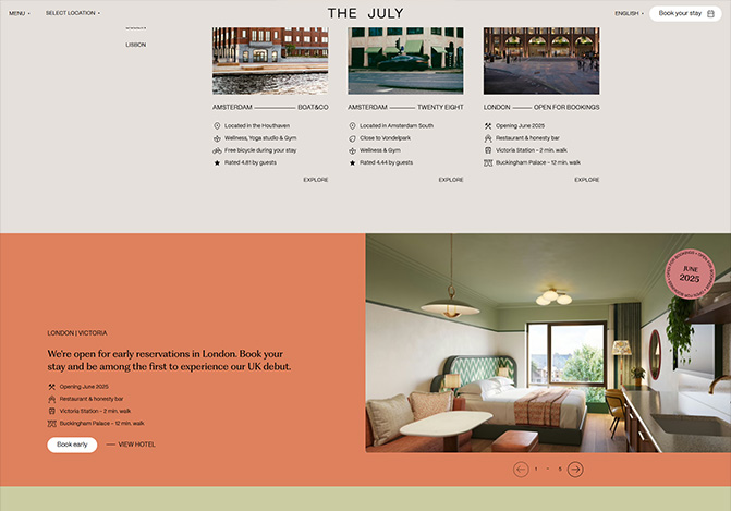
What really works is how the strong visuals and video content perfectly match the aesthetic you’d expect from their actual properties. The navigation is refreshingly straightforward, and each location page gives you the essential information without burying it under layers of marketing speak. It’s confident branding that knows exactly what it wants to say and says it clearly.
The Hoxton
What We Love
The Hoxton’s website gets the balance right between stylish and approachable. While many hotel sites either feel overly corporate or try too hard to be trendy, Hoxton keeps things clean and confident. The photography focuses on neighborhoods rather than just rooms, and the navigation feels intuitive without being flashy.
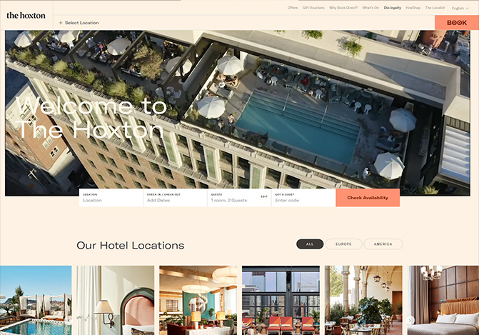
What I particularly like is how they’ve translated their “open house” philosophy online. Each location page gives you a real sense of the area and local culture, making you want to explore rather than just book and leave. It’s hotel web design that feels genuinely welcoming rather than just polished.
The Wayfinder Waikiki
Wayfinder Waikiki strikes the perfect balance between tropical energy and sophisticated design. This boutique hotel’s website perfectly captures their “brutalism meets paradise” aesthetic with vibrant colours and lush imagery that feels authentically Hawaiian rather than resort-generic. The navigation is clean and the content strikes the right tone between laid-back and informative.
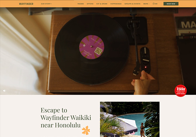
What works particularly well is how they’ve conveyed their local-first philosophy online. The site feels genuinely rooted in place, showcasing everything from local artist collaborations to neighbourhood culture without feeling forced. It’s refreshing to see a Hawaiian hotel website that doesn’t rely on tired tropical clichés but still celebrates the island’s genuine spirit and character.
The Sanubari
The Sanubari demonstrates how restraint can be more potent than excess. This luxury resort website embraces minimalist design principles while weaving in just enough textural elements to keep it warm and engaging. The clean lines and generous white space let the stunning Sumba Island photography speak for itself, while subtle details like local artisan touches add authentic character without overwhelming the aesthetic.
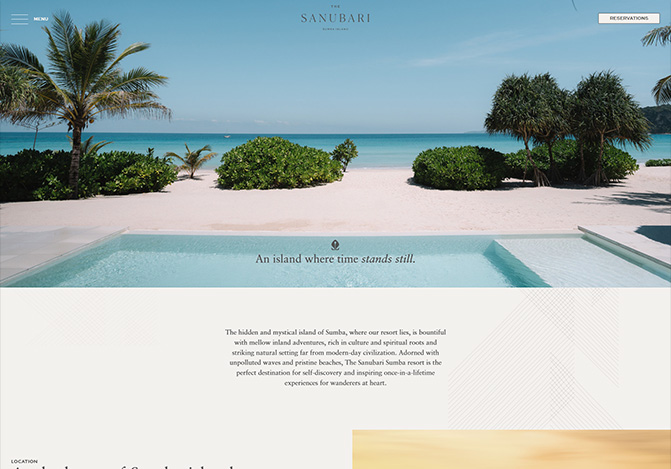
This is particularly compelling, as is how the understated approach amplifies the luxury positioning. Rather than shouting about amenities, the site quietly conveys exclusivity through thoughtful typography, carefully curated imagery, and intuitive navigation. It’s sophisticated web design that trusts its audience to appreciate quality without needing it spelt out in bold letters.
The Newman
The Newman captures boutique sophistication perfectly with a website that feels both contemporary and timeless. Opening in Fitzrovia in 2025, they’ve created a digital presence that embodies their “entirely Fitzrovian” positioning through elegant typography, a refined color palette, and carefully curated imagery. The site feels sophisticated without being precious, and the navigation is refreshingly intuitive.
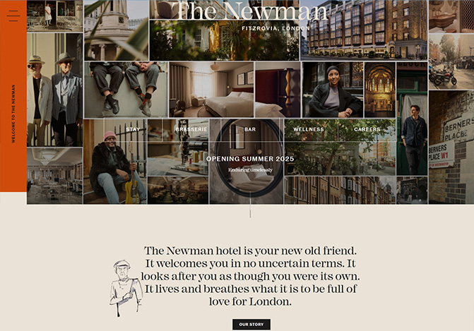
What works particularly well is how they’ve managed to convey luxury without resorting to the usual boutique hotel clichés. The art deco influences come through subtly, and the focus on their Nordic-inspired spa and thoughtful dining concepts feels authentic rather than forced. It’s a strong example of how to launch a new hotel brand with clear identity and confident design choices.